The Cult Of Bill 2:23 Mon Sep 26
Thoughts on the new badge?
|
|
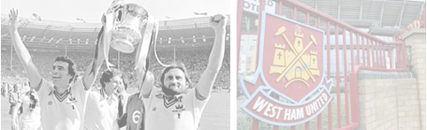
I think it´s awful and "London" on it ffs Embarrassing really. What was wrong with the old one?
https://static.standard.co.uk/s3fs-public/styles/story_medium/public/thumbnails/image/2014/07/18/11/west-ham.jpg
|
|
|

Replies - Newest Posts First ( Show In Chronological Order)
neilalex
11:46 Wed Sep 28
Re: Thoughts on the new badge?
|
Bit shit. For whatever reason reminds me of Warner Bros looney tunes logo. The 'London' thing is desperate. 'East' London, as suggested would have made a point but that wouldn't have supported a globally all inclusive, family fun filled branding exercise.
|
Bom Stickle
10:56 Wed Sep 28
Re: Thoughts on the new badge?
|
Here you go. Looks better now it's healed:
https://imgur.com/gallery/38Wgo
|
letsalldotheBarthez
10:33 Wed Sep 28
Re: Thoughts on the new badge?
|
Bom - any chance of you post a pic of it? What's claret and blue t- the hammers?
|
Bom Stickle
10:22 Wed Sep 28
Re: Thoughts on the new badge?
|
I can see why the castle came off, no problem with that as its been done before. The new hammers are really good, so much so I had them tattood on the back of my calf in claret and blue. The shape of the badge re-creating the hull of a ship is a nice touch as well.
The bad parts: The font of West Ham United is shit. Like the stadium if it said East before the London I'm fine with that, as it is it's trying to be something were not so add the word East or get rid.
|
The_Phantom
9:54 Wed Sep 28
Re: Thoughts on the new badge?
|
It's change.
Change is generally bad.
Therefore it's shit.
Old one was fine and didn't need to be changed
|
On The Ball
9:39 Wed Sep 28
Re: Thoughts on the new badge?
|
You must be delighted, Bulph.
|
stomper
9:29 Wed Sep 28
Re: Thoughts on the new badge?
|
'salright
|
Hasans Fish Bar RIP
9:24 Wed Sep 28
Re: Thoughts on the new badge?
|
The crossed hammers on their own are more old school and before my time, but I grew up with the castle and was a bit gutted to see it go. The font is my only gripe really and I actually like the nod towards London but should have been prefixed by 'East' if anything.
|
BulphanIron
9:20 Wed Sep 28
Re: Thoughts on the new badge?
|
Gone from best badge in the league to the worst I reckon...
|
Mrs Wilberforce
9:10 Wed Sep 28
Re: Thoughts on the new badge?
|
I like it. Never did like the castle. Anyway, I'm sure we wouldn't give a fuck about the badge if we were winning!
COYI!
|
Vexed
9:04 Wed Sep 28
Re: Thoughts on the new badge?
|
Crossed hammers, great. Shit fucking Tesco value font and cringeworthy London make it by far the shittiest badge in the league to go with our shit team, manager, owners and stadium.
|
11MDE
9:00 Wed Sep 28
Re: Thoughts on the new badge?
|
Love it.
|
collyrob
8:59 Wed Sep 28
Re: Thoughts on the new badge?
|
Looks brilliant, probably the best crest in the world after Celtics.
|
Gavros
8:57 Wed Sep 28
Re: Thoughts on the new badge?
|
i think its fucking shit and have done since i clapped eyes on the thing.
|
BulphanIron
8:50 Wed Sep 28
Re: Thoughts on the new badge?
|
Oh there's a surprise!
|
On The Ball
8:49 Wed Sep 28
Re: Thoughts on the new badge?
|
Any Old Iron 12:15 Mon Sep 26
Is the "old" crest the one you grew up with, by any chance?
|
On The Ball
8:47 Wed Sep 28
Re: Thoughts on the new badge?
|
I like 90% of it, but I hate 'London'.
I wonder what it would have looked like with 'United' down there? Not that that would have ticked the box they wanted to tick.
|
Cordell
8:29 Wed Sep 28
Re: Thoughts on the new badge?
|
In the minority, I know, but I like it without the castle. Say it quietly, I am not that offended by London being on it. Would have preferred "1895" if something "had" to be at the bottom, but I can live with it. I really, really, don't like the font, mind.
I like a lot of the newer modern badges, they look cleaner and unfussy. Wolves and watford look unique and are quite "Germanic" in thier design. I dislike ones that are hard to draw... Southampton, Newcastle, Manachester United, etc.
|
El Scorchio
1:40 Wed Sep 28
Re: Thoughts on the new badge?
|
Not that this hasn't been discussed ad infinitum on here already but...
It's not bad aside from two things- the fact LONDON is on it, and the font in general. It's too 'modern'.
The old crest was far, far, far better though. It was superb, and one of the best looking ones, and I'm sad they got rid.
|
Fivetide
12:58 Wed Sep 28
Re: Thoughts on the new badge?
|
I'm hoping this is all like the 'New Coke' marketing campaign of the 1980s, and it all turns out to be a bit of a ruse to make us appreciate 'Classic Coke/West Ham' that little bit more.
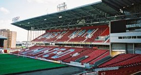
We'll be back in E13 with a castle on our badge as soon as this year's financials are in.
Or maybe not :/
|
Full Claret Jacket
11:14 Wed Sep 28
Re: Thoughts on the new badge?
|
YellowBellyHammer 7:20 Mon Sep 26
Awful. SInce the badge changed the performances have plummeted. Bring back the old badge that players showed pride for.
|
|